28 KiB
IMDB Clone React Website
Project Description
We will be creating an IMDB clone, where we will fetch Real-time trending movies data and will show it in grid format, we will be designing the whole application by using Tailwind CSS.
Features of the project
The following will be the features of our IMDB clone:
- The user will be able to view all the latest & trneding movies (IMDB API)
- User can create his own separate watchlist
- User can filter movies according to genre
- User can sort movies according to ratings
- Pagination will be implemented to move from one page to another to get updated data of other movies
- Search feature will be there for movies.
- We will be deploying this to netlify
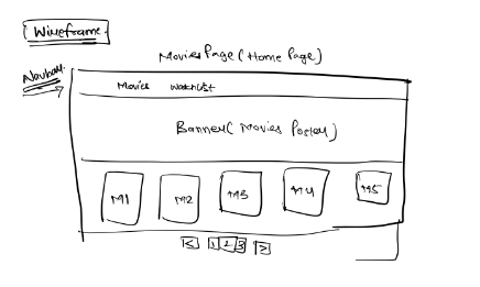
Wireframe
Implementation
What is tailwind css?
Tailwind CSS is a highly popular and innovative utility-first CSS framework for web development. Unlike traditional CSS frameworks that provide pre-designed components, Tailwind CSS focuses on providing a comprehensive set of utility classes that make it easier to create custom and responsive designs without the need for writing custom CSS.
Following are features of Tailwind CSS:
- Utility-First Approach: Tailwind CSS adopts a utility-first approach, offering a vast collection of small, single-purpose utility classes that can be combined to create complex designs and layouts. This approach promotes code reusability and rapid development.
- Customizable and Configurable: Tailwind is highly customizable through a configuration file, allowing developers to tailor the framework to match their project's specific design requirements. You can customize everything from colors and spacing to typography and breakpoints.
- Responsive Design Made Easy: Creating responsive web designs is simplified with Tailwind CSS. It provides responsive variants of utility classes, enabling developers to adapt the layout and styling of their websites for various screen sizes and devices effortlessly.
- Performance Optimization: Tailwind CSS is designed with performance in mind. It generates optimized CSS files by purging unused classes, resulting in smaller file sizes and faster loading times for web pages.
- Active Community and Ecosystem: Tailwind CSS has a thriving community of developers who contribute to its growth and share resources. Additionally, there are numerous plugins and extensions available that enhance Tailwind's capabilities, making it suitable for a wide range of web development projects.
In this application we will be integrating tailwind to our react app.
- tailwind.confing.js
/** @type {import('tailwindcss').Config} */
module.exports = {
  content: [
    "./src/**/*.{js,jsx,ts,tsx}",
  ],
  theme: {
    extend: {},
  },
  plugins: [],
}
Src
-
index.js:
- In this code snippet, we're diving into the world of web development with React, a popular JavaScript library for building user interfaces.
- We start by importing some essential tools:
ReactandReactDOM. These are the building blocks of React applications. Think of them as the magic wand and canvas, respectively, for creating interactive web experiences. - We also import a CSS file, './index.css'. This file likely contains styles to make our IMDb web page look visually appealing and engaging.
- The star of our show is the
Appcomponent, which represents the heart and soul of our IMDb website. We import it from './App', indicating that this component will be responsible for displaying our movie and TV show information. - Now, let's set the stage. We create a special variable called
rootusingReactDOM.createRoot(document.getElementById('root')). This variable acts as our spotlight, focusing on a specific area of the webpage where our IMDb content will appear. - Finally, it's showtime! We call
root.render(<App />), which is the grand moment when ourAppcomponent takes center stage and begins rendering. This means it starts building the entire IMDb web page, showing movie posters, cast lists, and everything else our users want to see.
Code:
import React from 'react';
import ReactDOM from 'react-dom/client';
import './index.css';
import App from './App';
const root = ReactDOM.createRoot(document.getElementById('root'));
root.render(
    <App />
);
- index.css:
Certainly, here's the provided CSS code snippet with an explanatory introduction:
-
index.css
- This CSS code snippet is all about styling our IMDb web page. CSS, or Cascading Style Sheets, is used to control the visual appearance of web content.
- The code begins with
@tailwinddirectives. These directives are used in conjunction with the Tailwind CSS framework. They help in defining the base styles, components, and utilities for our web page. Tailwind CSS is a utility-first CSS framework that makes it easy to style web applications. - Following the Tailwind directives, we have styles for the
bodyelement. These styles define how the main content of our IMDb webpage should look. Key aspects include:- Setting the margin to 0 to remove any default spacing around the page.
- Specifying a font-family to ensure a consistent and readable text display on various devices and browsers.
- Enabling font-smoothing and grayscale to enhance text readability and visual quality.
- Next, there are styles for the
codeelement. This is likely used for displaying code snippets or inline code within our IMDb web page. The specified font-family ensures that code is displayed in a monospace or fixed-width font, making it easy to read and distinguish from regular text.
Code:
@tailwind base;
@tailwind components;
@tailwind utilities;


body {
  margin: 0;
  font-family: -apple-system, BlinkMacSystemFont, 'Segoe UI', 'Roboto', 'Oxygen',
    'Ubuntu', 'Cantarell', 'Fira Sans', 'Droid Sans', 'Helvetica Neue',
    sans-serif;
  -webkit-font-smoothing: antialiased;
  -moz-osx-font-smoothing: grayscale;
}

code {
  font-family: source-code-pro, Menlo, Monaco, Consolas, 'Courier New',
    monospace;
}
- App.js:
Certainly, here's the code explanation for the provided App.js code:
-
App.js
- This JavaScript file is a central part of our IMDb web application. It's where we define how the entire app works and what components it consists of.
- We start by importing several components and libraries that our app depends on:
import './App.css';imports the CSS styles specific to ourAppcomponent, which are likely used to style the layout and appearance of the app.Movies,WatchList,Navbar, andBannerare components imported from their respective files. These components are used to build various parts of our IMDb app, such as displaying movies, the watchlist, the navigation bar, and a banner.BrowserRouter,Route, andRoutesare imported from 'react-router-dom'. These are essential for setting up client-side routing, allowing us to navigate between different pages in our app without a full page reload.
- Inside the
Appfunction, we set up various pieces of functionality for our IMDb app:- We use
useStateto create two state variables,watchListandpageNo. These states help manage the user's watchlist and the current page number. - There are also functions like
handlePrevandhandleNextto handle pagination by changing thepageNostate when users click on previous or next buttons. handleAddToWatchListandhandleRemoveFromWatchListfunctions allow users to add or remove movies from their watchlist. These functions update thewatchListstate and store the updated watchlist in local storage.- The
useEffecthook is used to retrieve the watchlist data from local storage when the component mounts, ensuring that users don't lose their watchlist when they revisit the app.
- We use
- The
returnstatement defines the structure of our IMDb app using theBrowserRouterandRoutes. Inside the routes, we render various components based on the route path:- On the root path ('/'), we render the
BannerandMoviescomponents, passing them necessary props likewatchList,pageNo, and functions for adding/removing from the watchlist. - On the '/watchlist' path, we render the
WatchListcomponent, providing it with the user's watchlist and functions to remove movies from it.
- On the root path ('/'), we render the
- The entire
Appfunction represents the main structure of our IMDb web application, orchestrating the rendering of different components and handling user interactions.
Code:
import './App.css';
import Movies from './Components/Movies';
import WatchList from './Components/WatchList';
import Navbar from './Components/Navbar';
import Banner from './Components/Banner';
import { BrowserRouter, Route, Routes } from 'react-router-dom';
import {useState,useEffect} from "react"


function App() {
  let [watchList,setWatchList] = useState([]);
  let [pageNo,setPageNo] = useState(1);


    let handlePrev = ()=>{
        if(pageNo>1)
            setPageNo(pageNo-1)
    }

    let handleNext = ()=>{
        setPageNo(pageNo+1);
    }

  let handleAddToWatchList = (movieObj)=>{
      // console.log("Inside add to watchlist");
      // console.log(movieId);
      // watchList.push(movieId); // it will not work since the reference is same

      let newWatchList = [...watchList,movieObj];
      localStorage.setItem("movieApp",JSON.stringify(newWatchList));
      setWatchList(newWatchList);
  }

  let handleRemoveFromWatchList = (movieObj)=>{
      let filteredWatchList = watchList.filter((movie)=>{
          return movie.id != movieObj.id;
      })
      localStorage.setItem("movieApp",JSON.stringify(filteredWatchList));
      setWatchList(filteredWatchList);
  }

  useEffect(()=>{
    let moviesFromLocalStorage = localStorage.getItem("movieApp");
    if(!moviesFromLocalStorage){
        return;
    }
    setWatchList(JSON.parse(moviesFromLocalStorage));
},[])


  return (
    <BrowserRouter>
      <Navbar/>

      <Routes>
        <Route path='/' element={
          <>
            <Banner/>
            <Movies watchList={watchList}
                    setWatchList={setWatchList}
                    handleAddToWatchList={handleAddToWatchList}
                    handleRemoveFromWatchList={handleRemoveFromWatchList}
                    pageNo={pageNo}
                    handleNext={handleNext}
                    handlePrev={handlePrev}/>
          </>
        }></Route>

        <Route path='/watchlist' element={
          <WatchList watchList={watchList}
                    setWatchList={setWatchList}
                      handleRemoveFromWatchList={handleRemoveFromWatchList}/>
        }
        ></Route>


      </Routes>
    </BrowserRouter>
    // <>
    //   <Navbar/>
    //   <Banner/>
    //   <Movies/>
    //   {/* <WatchList/> */}
    // </>

  );
}

export default App;
-
App.css
- This CSS code snippet is used to style elements within our IMDb web application. It defines various styles to ensure that the app looks visually appealing and functions correctly.
- The
.Appclass sets the text alignment to the center. This class is likely associated with the top-level element of our app. .App-logois used to style the IMDb logo. It sets the height to 40vmin (a relative unit based on the viewport size) and disables pointer events. This is often used for logos or images.- The
@mediaquery checks if the user prefers reduced motion. If not, it applies an animation to.App-logoto make it spin infinitely for 20 seconds in a linear fashion. This adds a dynamic touch to the logo when motion is allowed. .App-headerstyles the header section of our IMDb app. It sets the background color, minimum height, and configures it to be a flex container with content centered both horizontally and vertically. The font size is adjusted relative to the viewport size, and the text color is set to white..App-linkstyles links in the app with a blue color (#61dafb). This is a common styling for clickable links.- Finally,
@keyframes App-logo-spindefines an animation that smoothly rotates an element from 0 degrees to 360 degrees. This is used in conjunction with.App-logoto create the spinning effect of the IMDb logo.
Code:
.App {
  text-align: center;
}

.App-logo {
  height: 40vmin;
  pointer-events: none;
}

@media (prefers-reduced-motion: no-preference) {
  .App-logo {
    animation: App-logo-spin infinite 20s linear;
  }
}

.App-header {
  background-color: #282c34;
  min-height: 100vh;
  display: flex;
  flex-direction: column;
  align-items: center;
  justify-content: center;
  font-size: calc(10px + 2vmin);
  color: white;
}

.App-link {
  color: #61dafb;
}

@keyframes App-logo-spin {
  from {
    transform: rotate(0deg);
  }
  to {
    transform: rotate(360deg);
  }
}
Utility
  const genreids = {
    28: "Action",
    12: "Adventure",
    16: "Animation",
    35: "Comedy",
    80: "Crime",
    99: "Documentary",
    18: "Drama",
    10751: "Family",
    14: "Fantasy",
    36: "History",
    27: "Horror",
    10402: "Music",
    9648: "Mystery",
    10749: "Romance",
    878: "Sci-Fi",
    10770: "TV",
    53: "Thriller",
    10752: "War",
    37: "Western",
  };

  export default genreids;
Components
-
Banner.jsx:
- This JavaScript file defines the
Bannercomponent for our IMDb web application. TheBannertypically appears at the top of the web page and often showcases a prominent image or information related to the content. - Inside the component function, we use the
useStateanduseEffecthooks from React to manage component state and perform side effects. useStateinitializes a state variable calleddetailwith an initial value ofundefined. This variable will hold data related to the movie we want to display in the banner.- The
useEffecthook is used to make an HTTP GET request to the 'https://api.themoviedb.org/3/movie/upcoming' endpoint. This endpoint likely retrieves information about upcoming movies from a movie database. The API key '2816c138913c6ef73d40c883d36fbe56' is included in the request for authentication. - When the response is received successfully, it extracts data from the first movie in the results array and sets it to the
detailstate variable. - The
ifstatement checks ifdetailis still undefined. If it is, the component returns nothing (undefined). This likely prevents the component from rendering until it has retrieved movie data from the API. - If
detailhas a value (i.e., movie data has been fetched), the component renders:- A
divelement with a class that sets the background image of the banner. Theurl()function in thestyleattribute dynamically sets the background image using theposter_pathproperty from thedetaildata. - Inside this
div, there's anotherdivelement that contains text. This is likely the movie title displayed on top of the banner image. - The styling includes making the text white, applying a semi-transparent gray background, and centering the text both horizontally and vertically. The
text-xlclass sets the font size to extra-large.
- A
- The
Bannercomponent fetches data about an upcoming movie and displays it as a banner on the IMDb webpage, creating an attractive and engaging visual element for users.
- This JavaScript file defines the
Code:
import axios from "axios";
import { useEffect, useState } from "react";

function Banner(){
    let [detail,setDetail] = useState(undefined)

    useEffect(()=>{
        axios.get('https://api.themoviedb.org/3/movie/upcoming?api_key=2816c138913c6ef73d40c883d36fbe56')
        .then(function(res){
            // console.log(res);

            // console.log(res.data.results[0].poster_path);
            let data = res.data.results[0]
            setDetail(data);
        })
    },[]);

    if(detail == undefined){
        return
    }
    return(
        <div className="h-[20vh] md:h-[70vh] bg-cover bg-center flex items-end"
        style={{backgroundImage:`url(https://image.tmdb.org/t/p/original/${detail.poster_path})`}}>
            <div className="text-xl text-white bg-gray-900/60 w-full p-4 text-center ">
                {detail.title}
            </div>
        </div>
    )
}

export default Banner;
-
MovieCard.jsx:
- This JavaScript file defines the
MovieCardcomponent. AMovieCardis a visual representation of a movie that users can interact with in our IMDb web application. - The component function takes several props:
movieObj: An object containing information about the movie, including itsid.handleAddToWatchList: A function to add the movie to the user's watchlist.handleRemoveFromWatchList: A function to remove the movie from the user's watchlist.name: The name or title of the movie.watchList: An array representing the user's watchlist.poster_path: A URL to the movie's poster image.
- Inside the component, there's a function
isContain(movieObj)that checks if themovieObjis already in the user's watchlist. It iterates through thewatchListarray and returnstrueif it finds a movie with the sameid, indicating that the movie is in the watchlist. Otherwise, it returnsfalse. - The component's
returnstatement defines the structure and appearance of aMovieCard. It's adivelement with the following features:- A fixed height and width (
h-[40vh]andw-[200px]) to maintain a consistent size for movie cards. - The
bg-centerandbg-coverclasses ensure that the background image (the movie poster) is centered and covers the entire card. - The
rounded-xlclass rounds the corners of the card, giving it a pleasant look. - On hover, the card slightly scales up (
hover:scale-110) and the cursor changes to a pointer (hover:cursor-pointer), providing a visual cue that the card is interactive.
- A fixed height and width (
- Inside the card, there's a dynamic icon that changes based on whether the movie is in the user's watchlist or not. If the movie is in the watchlist, it displays a "remove" icon (❌), and clicking it calls the
handleRemoveFromWatchListfunction. If the movie is not in the watchlist, it displays an "add" icon (😁), and clicking it calls thehandleAddToWatchListfunction. - Below the icon, there's a text element displaying the movie's name or title. It has a white text color, a semi-transparent gray background, and is centered both horizontally and vertically. The
text-xlclass sets the font size to extra-large. - This
MovieCardcomponent is a reusable card for displaying movie information and interacting with the user's watchlist. It provides a visually appealing and user-friendly way to add or remove movies from the watchlist.
- This JavaScript file defines the
Code:
export default function MovieCard(props){
let {movieObj,handleAddToWatchList,handleRemoveFromWatchList,name,watchList,poster_path} = props;
function isContain(movieObj){
for(let i=0;i<watchList.length;i++){
if(watchList[i].id == movieObj.id){
return true;
}
}
return false;
}
return(
<div className="h-[40vh] w-[200px] bg-center bg-cover
rounded-xl hover:scale-110 duration-300 hover:cursor-pointer
flex flex-col justify-between items-end overflow-hidden"
style={{
backgroundImage: `url(https://image.tmdb.org/t/p/original/${poster_path})`,
}}>
{isContain(movieObj)?
<div onClick={()=>handleRemoveFromWatchList(movieObj)} className="m-4 bg-gray-900
flex justify-center items-center
h-8 w-8 rounded-lg">
❌
</div>
:<div onClick={()=>handleAddToWatchList(movieObj)}
className="m-4 bg-gray-900
flex justify-center items-center
h-8 w-8 rounded-lg">
😍
</div>
}
<div className="text-xl text-white
bg-gray-900/60 w-full p-2 text-center ">
{name}
</div>
</div>
)
}
-
Movies.jsx
- This JavaScript file defines the
Moviescomponent, which is responsible for displaying a list of trending movies on our IMDb web application. - The component function takes several props:
watchListandsetWatchList: These props are used to manage the user's watchlist.handleAddToWatchListandhandleRemoveFromWatchList: Functions for adding and removing movies from the watchlist.pageNo: The current page number, which is used for pagination.handleNextandhandlePrev: Functions for navigating to the next and previous pages of trending movies.
- Inside the component, there's a
useStatehook that initializes a state variablemoviesas an empty array. This variable will store the list of trending movies fetched from an API. - The
useEffecthook is used to make an HTTP GET request to the 'https://api.themoviedb.org/3/trending/movie/day' endpoint. ThepageNoprop is included in the request to retrieve a specific page of trending movies. The API key '2816c138913c6ef73d40c883d36fbe56' is used for authentication. - When the response is received successfully, it extracts the list of trending movies from
res.data.resultsand sets it to themoviesstate variable. - The component's
returnstatement defines the structure of the Movies component:- A title ("Trending Movies") displayed in a large and bold font at the top.
- A flex container (
flex flex-wrap justify-around gap-8) that arranges MovieCard components in a responsive grid layout. EachMovieCardrepresents a trending movie.
- Inside the flex container, a
.map()function is used to iterate through themoviesarray and generate aMovieCardcomponent for each movie. Thekeyprop is set to the movie'sidfor React's reconciliation. - The
MovieCardcomponent is passed various props, including movie information, watchlist data, and functions for adding and removing movies from the watchlist. - After displaying the list of movies, a
Paginationcomponent is rendered. This component allows users to navigate between pages of trending movies using thepageNo,handleNext, andhandlePrevprops. - The
Moviescomponent is responsible for rendering trending movies and providing user-friendly interactions for adding/removing movies from the watchlist and pagination.
- This JavaScript file defines the
Code:
import MovieCard from "./MovieCard";
import axios from "axios"
import {useEffect, useState} from "react"
import Pagination from "./Pagination";

function Movies(props){
    let {watchList,setWatchList,
        handleAddToWatchList,handleRemoveFromWatchList,
        pageNo,handleNext,handlePrev} = props;

    let [movies,setMovies] = useState([]);


    useEffect(()=>{
        axios.get(`https://api.themoviedb.org/3/trending/movie/day?api_key=2816c138913c6ef73d40c883d36fbe56&page=${pageNo}`)
        .then(function(res){
        // console.log(res);
        // console.log(res.data.results);
        setMovies(res.data.results);
    })
    },[pageNo])


    return(
        <div className="p-5">
            <div className="text-2xl m-5 font-bold text-center">
                Trending Movies
            </div>
            <div className="flex flex-wrap justify-around gap-8">
                {movies.map((movieObj)=>{
                    // console.log(movieObj);
                    return <MovieCard key={movieObj.id}
                                    movieObj={movieObj}
                                    name={movieObj.title}
                                    poster_path={movieObj.poster_path}
                                    watchList = { watchList}
                                    handleAddToWatchList = {handleAddToWatchList}
                                    handleRemoveFromWatchList = {handleRemoveFromWatchList}/>
                })}
            </div>
            <Pagination pageNo={pageNo}
                        handleNext={handleNext}
                        handlePrev={handlePrev}/>
        </div>
    )
}

export default Movies;
-
Navbar.jsx
- This JavaScript file defines the
Navbarcomponent, which represents the navigation bar at the top of the IMDb web application. The navigation bar typically contains links to different sections or pages of the website. - Inside the component function, we use the
Linkcomponent from the 'react-router-dom' library to create navigation links. This allows users to navigate between different sections of the IMDb website without a full page reload, providing a seamless user experience. - The component renders the following elements:
- An
imgelement with a source (src) that appears to be a base64-encoded image. This is likely the IMDb logo. Thealtattribute is empty, indicating that this is a decorative image without alternative text. - A
Linkcomponent with atoprop pointing to the root path ("/") of the application. This link represents the "Movies" section of the website. It has a large font size, a bold font-weight, and a hover effect that changes the cursor to a pointer, making it clear that it's clickable. - Another
Linkcomponent with atoprop pointing to the "/watchlist" path. This link represents the "Watchlist" section of the website. Similar to the "Movies" link, it has a large font size, bold font-weight, and a hover effect.
- An
- The
Navbarcomponent provides essential navigation options, allowing users to easily switch between the "Movies" and "Watchlist" sections of the IMDb website, enhancing the overall user experience.
- This JavaScript file defines the
import { Link } from "react-router-dom";

function Navbar(){
    return(
        <div className="flex items-center p-3">
            <img className="h-[50px] mx-6" src="data:image/png;base64,iVBORw0KGgoAAAANSUhEUgAAAMgAAADICAMAAACahl6sAAAAflBMVEX///8AAACrq6tTU1MnJyd/f3/X19cEBAT29vaTk5P8/Pz5+fnGxsYJCQkXFxdkZGQsLCyampoyMjLNzc12dna+vr7p6em3t7ddXV1ra2s5OTkjIyPj4+McHBzw8PCioqJERERISEiHh4eUlJRxcXFNTU09PT2mpqaDg4MYGBiakx2lAAAFqklEQVR4nO2c6ZaiMBCFEVpww12x3de25/1fcJBuSVWCkoARzsz9fk2TAXOh6qYqeHQcAAAAAAAAAAAAAAAA+G+Y++uqp1CadfR92TQajc2uU/VUCrN2p4d+I2Va9XwK0PGv56+wIdGrelpGdCejz6WiIWFQ9dx0afVOg3GQqSFhWPUENdjO2ovhEw0JQavqaT5lHh29VY6EuifJOmom1qpLu+oJZ+Bza9VjUfWsGR1/l2GtWtQm259YqxZ1yPY8a9Wj2mzXslaJzaWZ5QKVZbuBtd4JPhbH2dxxzlmDVWT72jWz1phw+Tnq/aZBO/N/vDnbC1hrfz+9+qROd+ngOPWHt2V7MWsNr3LbNKPXWM2X6b/fkO3FrTWI5Gv59Dp93/lM/7Cb7a1eu4y1juTrrWluhfFDGKV/Wcv27ey4+DCc+MpjJtBUrjmmw258ZJL+ZSPbC1hrrOE42zoneki5x909HU5iqZs+7hdnewFrbdyWh21yNnOkQ1e++IIO//bp4hm9LNv963RvaK3BcNHubdMr9Ggmj5U7PKWn3h/XID3ygmwvZq1eu8fn6tPbsJrLn8LCbt9VjpbL9uLW+ilfak7TKnZWiYia3zB9jD1xrKiGctbqyZtqLepIoRLwLOw2Yplslcr2AtYaDNlzW8qf2jnQYVf+RBZ2IX1cw/SwWbbPo2/jqnU8iCs+FuIfSgYM6LCStyzsghkdWjw+6xHdqHn5Y6bhVrVOkrxkztpXNp6bdFjZAWVh17iyMVEM62a7a+atsYbdJE0EFuLhRL72iJ6pTIiH3VHc2cloIOpf3WyPDEQszzufJTMLcbUUZI60VxZCFnY/bpfVH2tm+7ChzVk+l4V4YycPT+jjEs5655ue7HVit3zQH2tlu6+vw5PP5SH+LQ+v6ePaKOmzoycH3hO3POkI0Y+sLzk0eIgrG+dzOrXw+UL4HKXqz+LREwnjTtR9Hhqs1jsoC+GSjHJnvTExKBuUm5BFR73gn0PTvQUC63bU0GDOqpSCHY8OX6XReWRglXsdHY5Db1zcPXxH9zVtS20gx1nVUvCTDh/JQFxMm+1TrDTfiopPXMxo9LBuRw0NFuJqKXikU/l1u1aBQjQYH3VLLXFn+cLLMkBxVr4QKv54pSfHdeStiDPdegyTCkhThUO74z09zLqdo3xSzkI4o3MOp8a9ZVI9KOtnDiLbQ3KUbfs9bzFUd/RLbL+H+/PVL/Z+XaxqItJZKai2GMwglFJwbfoAfukfpm6ZrzuIbE8zgWWA2mJc6McrpeDaoOi5s7k0o9Jf2RDZfg8hlgE5LQYrBdcF3q6tvGOkfEQhRLYvfw7wJlu5UazWG98d23cL7bXMlHqhOGIvLEySgTfZykLIar3N7V761/PeeHkYnEysVQ8x8dusWSmY02KErvl+kWguX46I+ZEjZcDzFsOU8EtuzF6LyPaBVAqqLYZhb59ys1atIrYMItvHvBRUWoyt6Tb8jdhaSy0P+pCdb5dmwIVGgbQhoMfrrFUPke1UR9piFHphLrbi38ggayZJi/F4Q+AxsbXK29jv4pQxnf7k9tLf8DFYtFYtellzMtVg2Vq1aJX7xkjyxrxiCb8UqFfJs/iwy/Ci//3fRf50K2Wv6x3ZXwOpEbpfm83K9loRaC6rraonmotShT+gSA31VpR3dg/w8i9VLRBSN8yFBHWijJCa1Bo/NCEEQuwAIRBiCQiBEEtACIRYAkIgxBIQAiGWgBAIsQSEQIglIARCLAEhEGIJCIEQS0AIhFgCQiDEEhACIZaAEAixBIRAiCUgBEIsASEQYgkIgRBLQAiEWAJCIMQSEAIhloAQCLFEGSEHr0Z8lBBSUyCkbkBI3dAVMs2/VLXorgoGP5ZbCWNNHdLPatUO9QfkHtMu81Nmlhkb6HCc1sytKbWqmgAAAAAAAAAAAAAAAP8SfwGtIGmvToPJOQAAAABJRU5ErkJggg==" alt="" />
            <Link to={"/"} className="text-3xl mx-6 font-bold text-sky-600 hover:cursor-pointer">Movies</Link>
            <Link to={"/watchlist"} className="mx-6 text-3xl font-bold text-sky-600 hover:cursor-pointer">WatchList</Link>
        </div>
    )
}

export default Navbar;